What is the smallest font on Google Docs? The clear answer is that Google Docs can usually accept very tiny manually typed font sizes, but the smallest practical size depends on whether you mean the smallest possible number, the smallest readable text, or the font that visually looks most compact.
You may see 6 pt or 8 pt in font-size menus and assume that is the limit, but Google Docs often lets you type smaller numbers directly into the size box. That does not mean every tiny size is useful, because 1 pt text is almost invisible, 6 pt is best for fine print, and 8 pt is usually the lowest comfortable size for real reading.
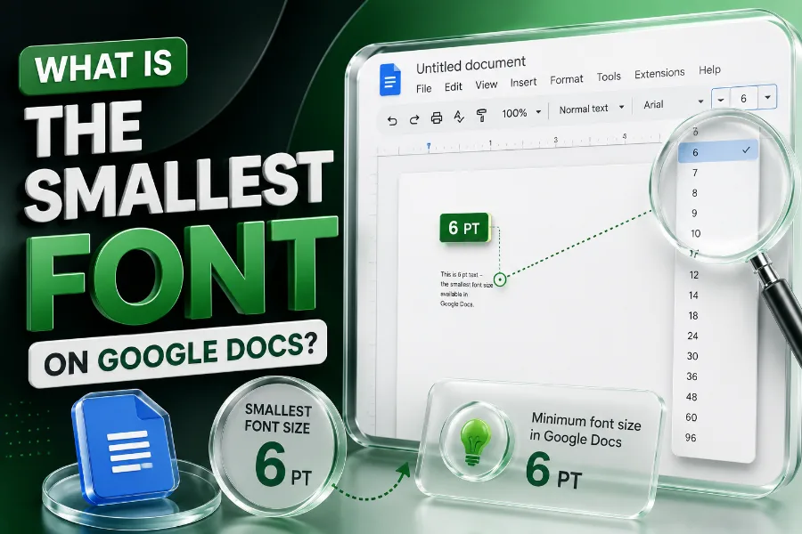
What Is The Smallest Font On Google Docs?
The smallest font on Google Docs is often described in two ways, and this is where most confusion begins. Technically, you can click the font-size box, type a very small number such as 1, and press Enter, but practically, most readers will struggle with anything below 6 pt.
The dropdown menu may not show every possible size, so you should not treat the visible options as the full limit. If you only use the dropdown, you may think the smallest font is 6 pt or 8 pt, but manual entry can give you more control.
The more useful answer is that 6 pt is the smallest realistic size for fine print, while 8 pt is usually the smallest size you should use for readable supporting text. If your goal is visual style rather than document compression, a font generator that create stylish text faster can help you test decorative text ideas, but Google Docs still needs clean formatting for serious documents.
Think of 1 pt as a technical trick, not a writing solution. It may work for hidden notes, design experiments, or testing, but it should not carry important information in a school paper, business report, résumé, or client document.
For most users, the best answer is simple: use 6 pt only for fine print, use 8 pt for small readable text, and use 10 to 12 pt for normal body copy. That balance protects readability while still helping you fit content into a tight layout.
Why Google Docs Font Sizes Can Be Confusing
Google Docs can be confusing because the number in the font-size box does not always explain how the text will actually look. Two fonts at 8 pt can appear very different because each typeface has its own height, width, spacing, x-height, and stroke thickness.
A narrow font may fit more words on one line, even when it uses the same point size as a wider font. That is why Arial Narrow, Roboto Condensed, BenchNine, and similar fonts can feel smaller than standard fonts without forcing you into unreadable sizes.
The interface also adds to the confusion because the dropdown shows common sizes, not every size the editor may accept. When you type the number manually, Google Docs gives you more flexibility than the menu suggests.
You should also separate screen readability from print readability. A 6 pt font may look barely acceptable when zoomed in on your laptop, but it can become frustrating on paper, especially for older readers or people with vision difficulties.
This is why the smartest approach is not to chase the lowest possible number. Instead, test the font at actual size, export or print a sample, and ask whether a normal reader can understand the text without zooming, squinting, or guessing.
Smallest Possible Size Vs Smallest Readable Size
The smallest possible size is the number Google Docs lets you enter, while the smallest readable size is the size real people can comfortably read. Those two things are not the same, and treating them as equal usually leads to cramped, unpleasant documents.
A 1 pt font is technically tiny, but it is too small for normal reading. A 4 pt font may still be visible in certain cases, but it is usually too hard to read unless the reader zooms in heavily.
The more practical range starts around 6 pt for fine print, labels, disclaimers, image captions, or compact notes. If you are also working on social captions or profile text, instagram font generator tools can show how stylized text changes appearance, but Google Docs documents still need readable fonts when the content matters.
For ordinary reading, 8 pt is a safer minimum. It can work for footnotes, tables, compact references, or supporting details, especially when you use a clean font with strong contrast.
For main body text, 10 to 12 pt remains the better range for comfort and professionalism. Your reader should focus on the message, not on the effort required to decode the letters.
The rule is easy to remember: possible does not mean practical. Use the smallest size only when the content is minor, the audience can still read it, and the document still looks intentional.
Best Tiny Fonts To Use In Google Docs
The best tiny fonts in Google Docs are usually clean, narrow, and simple. Fonts with open letter shapes, balanced spacing, and strong strokes stay readable better than decorative fonts when you reduce the size.
Arial Narrow is a common choice because it saves horizontal space without looking strange. Roboto Condensed is another strong option because it feels modern, professional, and readable in compact layouts.
BenchNine can work well when you need a tall, narrow appearance. It gives text a slim look, which helps you fit more content without making the font size dangerously small.
If you enjoy testing unusual text styles outside formal documents, a cool symbols and fonts page can show how symbols and stylish characters change visual tone, but serious Google Docs writing should still use simple fonts for accessibility. Decorative fonts may look fun in a headline, but they quickly become messy in tiny body text.
Verdana, Calibri, Tahoma, and Times New Roman can also work in small sizes, though each behaves differently. Verdana is wider but very readable, while Times New Roman fits more text because its letters are narrower.
Avoid cursive, novelty, and heavily decorative fonts when working below 10 pt. Tiny text already creates friction, so the font itself should make reading easier, not harder.
When You Should Use Very Small Fonts
Very small fonts make sense when the text supports the main document rather than carrying the main message. Good examples include footnotes, source details, table notes, disclaimers, labels, captions, and secondary explanations.
A 6 pt font can work for legal-style fine print, but only when the information is not the main reason the reader opened the document. If the detail affects a decision, payment, deadline, instruction, or warning, making it too small can feel unfair or careless.
In academic writing, small fonts are often used for footnotes and citations, but you should always follow your required style guide. Many schools, journals, and instructors set strict font rules, and using smaller text to bypass page limits can create problems.
In business documents, tiny fonts should be used sparingly. A proposal, contract summary, one-page flyer, or résumé may need compact formatting, but readability still matters more than squeezing in every sentence.
In design mockups, small fonts can show hierarchy and balance. A tiny caption can make a layout feel polished when it supports a larger heading, but the overall design still needs enough white space.
Use small fonts when they clarify structure. Do not use them to hide important information, manipulate page length, or make a crowded document look finished when it really needs editing.
When You Should Avoid Tiny Fonts
You should avoid tiny fonts when the reader needs to understand the information quickly. Instructions, warnings, pricing details, deadlines, medical information, educational content, and legal obligations should never rely on text that feels hidden.
Tiny fonts also create accessibility issues. Many readers use phones, older monitors, printed copies, or assistive tools, and extremely small text can make a document harder for them to use.
You should also avoid very small fonts in résumés. Hiring managers often scan quickly, and a résumé that uses tiny text to squeeze in too much information can look dense, desperate, or difficult to read.
Small text is risky in presentations, too. A font that looks acceptable on your screen may become unreadable on a projector, especially from the back of a room.
You should also be careful with forms. If labels, instructions, or consent language are too small, users may skip details or make mistakes.
The safest rule is to ask whether the reader benefits from the smaller size. If the only benefit is that you can pack more words onto the page, the better solution is usually editing, spacing, or layout adjustment.
How To Set The Smallest Font In Google Docs
To set a small font in Google Docs, highlight the text you want to change. Then click the font-size box in the toolbar, type your chosen size, and press Enter.
If the dropdown does not show the size you want, manual typing is the key step. This is how users often test sizes smaller than the standard menu options.
Start with 8 pt before trying anything smaller. If the text still looks clear and the content is only supporting information, you can test 7 pt or 6 pt.
Always zoom back to 100 percent before judging the result. A document may look readable at 150 percent zoom, but that does not reflect how readers will see it by default.
If the document will be printed, print one test page. Paper output often reveals spacing, contrast, and legibility problems that are easy to miss on screen.
You should also test the font choice, not just the size. A clean condensed font at 8 pt may fit better and read more clearly than a decorative font at 10 pt.
Use small font sizes in limited sections. A full page of tiny text usually signals that the content needs stronger editing or a better layout.
How To Make Text Smaller Without Hurting Readability
You can make text feel smaller without pushing the font size too low. The best method is to use a condensed font that naturally takes up less horizontal space.
You can also adjust margins, line spacing, paragraph spacing, and table widths. These changes often save more room than reducing the font from 8 pt to 6 pt.
Line spacing is especially important. If you use tiny fonts with tight spacing, the letters can crowd together and become harder to follow.
Margins can help when you need more room, but they should not make the page feel cramped. For most documents, modest margin changes look better than extreme compression.
Tables can also organize dense information more efficiently. Instead of writing long paragraphs in tiny text, you can use short labels, columns, and clean spacing.
Editing is still the most powerful space-saving tool. Removing repeated phrases, weak modifiers, and unnecessary explanations can create a cleaner document without making the reader work harder.
A document should feel compact, not squeezed. The goal is to save space while keeping the reading experience smooth.
Best Font Sizes For Different Google Docs Uses
For normal body text, 10 to 12 pt is usually the safest range. This size works well for essays, reports, letters, articles, guides, and most professional documents.
For footnotes, 8 pt is often readable and neat. You may use 6 pt for brief fine print, but you should test it before sending or printing the document.
For tables, 8 to 10 pt usually works well. Tables can become hard to read when every cell contains dense text, so shorter wording is often better than smaller letters.
For résumés, 10 to 11 pt is generally safer than 8 pt. A résumé needs to look polished, readable, and selective, not packed to the edge with tiny details.
For flyers and posters, the smallest text depends on viewing distance. A caption that works on a handout may be unreadable on a wall poster.
For classroom or training materials, avoid pushing below 10 pt for key information. Students and participants should not need to zoom in or strain to understand instructions.
Use 6 pt only for content that can afford to be small. Use 8 pt when space is tight but readability still matters.
Accessibility And Reader Experience Matter
Accessibility should guide every decision about small fonts. A document that looks efficient to you may feel frustrating to someone reading it on a phone, tablet, small laptop, or printed page.
Small fonts can create problems for readers with low vision, eye strain, dyslexia, or attention difficulties. Even readers with strong eyesight may lose focus when text is packed too tightly.
Contrast matters as much as size. Tiny gray text on a white background may look stylish, but it often fails in real-world reading conditions.
You should use dark text on a light background for small font sizes. If you reverse the colors, test carefully because tiny white text on a dark background can blur on some screens.
White space also supports accessibility. Proper spacing between lines, paragraphs, and sections helps the eye move naturally through the document.
The reader experience should come before the urge to compress. If a small font makes the document less useful, it is the wrong choice.
A professional document respects the reader’s time and attention. That means clear hierarchy, readable text, and formatting that supports the message.
Common Mistakes With Small Fonts
One common mistake is using tiny fonts to avoid editing. If your document has too many words, reducing the font size may hide the real issue instead of solving it.
Another mistake is choosing a decorative font for small text. Fancy letters, thin strokes, and unusual shapes lose clarity quickly when the size drops.
Many users also forget to test the document at normal zoom. If you write and format while zoomed in, you may not notice that the final version is hard to read.
A fourth mistake is using small fonts for important details. Pricing, conditions, warnings, deadlines, and instructions should be clear, not buried in tiny text.
Some users also mix too many font styles. A document with several tiny fonts can look inconsistent and unprofessional.
You should also avoid shrinking only one section so it fits a page. That trick can make the layout feel uneven and draw attention to the squeezed area.
Small fonts work best when they are intentional. They should support hierarchy, not repair weak organization.
Practical Rule For Choosing A Tiny Font
Start with the purpose of the text. If the reader must understand it immediately, keep it at a comfortable size.
If the text is secondary, try 8 pt first. This size often gives you a compact look while keeping the words readable.
If 8 pt still takes too much space, switch to a condensed font before dropping to 6 pt. A narrow font can solve the space problem without making the letters painfully small.
Use 6 pt only for short, low-priority text. It can work for labels, legal-style notes, and brief disclaimers, but it should not become the main reading size.
Avoid anything below 6 pt unless you have a special design reason. At that point, the text is more like a visual element than readable content.
Print or export a test copy whenever the document matters. A quick test can save you from sending a file that looks polished on your screen but fails for readers.
The best tiny font is not always the smallest one. It is the one that saves space while still letting people read with ease.
Conclusion
What is the smallest font on Google Docs? The best answer is that Google Docs may let you manually enter extremely small sizes, even down to 1 pt in many cases, but 6 pt is the smallest practical fine-print size and 8 pt is usually the lowest comfortable size for readable supporting text.
You should not choose a font size only because it is technically possible. Choose it because it serves the reader, fits the document’s purpose, and keeps the layout clean.
For most Google Docs projects, use 10 to 12 pt for body text, 8 pt for compact supporting text, and 6 pt only for brief fine print. That approach gives you the space-saving benefit of small text without turning your document into something readers have to fight through.